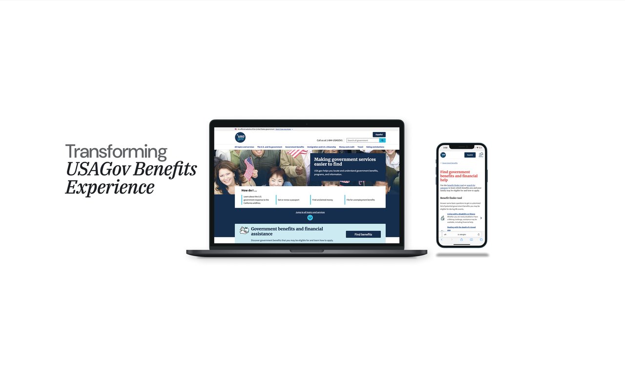
Screen placeholders — drop in the exported USAGov frames (live at usa.gov and usa.gov/es).
When Benefits.gov was decommissioned, millions needed a seamless path to keep accessing vital government benefits. I led bilingual research and design to make that journey frictionless, accessible, and successful — in English and in Spanish.
USAGov serves the entire American population — 2.5 million benefits-page visits a month — which made a single primary audience impossible to name. I grounded the redesign in behavioral data and validated personas, then designed a bilingual benefits-finder path that let people learn what they qualify for in under five minutes.
USAGov serves the whole country, so previous efforts to improve the benefits experience stalled on the sheer breadth of users and the complexity of government resources. Stakeholders needed a clear, research-driven way to understand real needs and structure content around them — not another redesign built on assumptions.
Unclear navigation and CTAs left people unable to locate the programs relevant to them.
The lack of filtering made searching for the right benefit cumbersome and slow.
Accessibility barriers in Spanish drove measurably lower benefit-application rates.
High contact-center volume was a direct signal of where self-service was failing.
Rather than guess at a primary user, I partnered with data analysts to examine top tasks, most-visited pages and search behavior, then validated proto-personas through usability testing and partnerships with grassroots organizations. Research ran natively in English and Spanish.
Top searches: SNAP, housing assistance, unemployment, healthcare access.
“I need clear instructions & online forms available online that can be accessed on my phone.”
“I’ve spent more than an hour on the phone providing the same information across government agencies.”
“I want to see all of the benefits I qualify for in one place, and in my preferred language.”
60% of surveyed users struggled to understand eligibility requirements · 45% struggled to find the right application links.
Built directly on the research, the redesign gave people a dedicated benefits landing page with clear CTAs, real filtering, and a Benefits Finder wizard that returns a personalized shortlist in minutes — with a Spanish experience designed as a first-class path, not a translation afterthought.
Clear CTAs and intuitive structure that reduce friction at the very first step of discovery.
A short questionnaire that tells people what they may qualify for in under five minutes.
Advanced filtering that lets people narrow to exactly the programs relevant to them.
A natively designed Spanish path — the single biggest driver of the application lift.
Screen placeholders — drop in the exported USAGov frames (live at usa.gov and usa.gov/es).
The redesign restructured content around real user intent and top tasks — and the results showed up in access, engagement and cost.
Beyond the immediate redesign, the discovery work gave the product team the evidence to advocate for budget behind personalization and the long-term vision of USAGov 2035. A dedicated team was assembled to carry it forward — which I now help lead as Bilingual UX Researcher & Designer.
“A natural leader who embodies the consultant mindset. Natalie easily negotiates priorities, always keeping the end user in mind, and is deeply empathetic during user interviews — highly important on a project that touches vulnerable populations.”
Public Experience Lead, GSAI design and research bilingual experiences that reach the people most studies miss — and prove it with the numbers that matter.